Growth as a Creative
- Lou Gebbie

- Apr 29, 2025
- 9 min read

It can be hard to see the growth you've made in your art as a creative in the moment, day to day and month to month. However, when you look back, you can. In this blog, I will share a few pieces of work I created in Sixth Form eight to nine years ago, along with a few from university and some I created more recently, to illustrate how I have grown.
Sixth Form
Blood Of The Alternative: CD Cover & Tour Poster


For my Year 12 media class, I created a CD cover and tour poster for a fictional alternative rock band called The Blood Of The Alternative. The band's theme revolves around blood and clocks, in line with its album title, "Anti-Clockwise."
The tour poster features a grandfather clock I drew, with a blurred clock face to suggest anti-clockwise movement, enhanced with angel wings and dripping blood. The CD cover's back includes essential info like the band name and song list, while the inside showcases band members' names alongside the bloody grandfather clock. The front cover features a black watch with blurred numbers and blood drops, maintaining visibility of the clock face beneath. All designs were made in Adobe Photoshop.
I remember having a great deal of fun with this project, from creating the band name and branding to designing the graphics. I combined different media and skills, using a mixture of photography and illustration to create the clock-related visuals. Looking at it now, the designs might be a bit excessive, and I wouldn’t wrap the text as I did in the poster, but I demonstrated potential and was learning. Furthermore, graphic design trends have evolved over the past nine years, and nowadays I would include a QR code.
Comic book - The War Against Psychopaths
A.K.A the cursed comic (What was 16-year-old me thinking?)


This is a comic book issue that I created for one of my Media units. This comic is set in the future in the year 3946, and the world has been taken over by the massive organisation called The Psychopathic Rebellion Tribe Organization (TPRTO), which is a bunch of psychotic, insane, egotistic people, whose primary purpose is to create absolute, devastating chaos all over the world. The village of my two main characters, Phoenix and Storm, had been attacked by the Local Psychopathic Rebellion Tribe (TLPRT or Psycho Rebels for short), and they almost killed everyone. Somehow, Phoenix and Storm escape, but they get separated in the process. It is up to the twins to find one another and stop the Psychopathic Rebellion Tribe Organisation.
The entire idea for this comic evolved from the initial sketch I made of the lead character, Phoenix (the one with burgundy hair), in which I accidentally drew eyes that appeared rather creepy. After joking about it with my friends, I decided to embrace it and create this dystopian futuristic comic. Drawing and creating digital art like this isn’t my strong suit, and I ended up using many Pinterest poses to help me achieve the right angles and positions necessary to tell the story. Nowadays, I use Pinterest more for inspiration and have also identified my art style and technique, which is vector-based illustration, with a cartoony or straightforward graphic quality.
Tech World


For this project, I designed three digital graphics for the ICT class. For this unit, I created a logo, a web banner, and a hoarding (billboard) for a smart technology shop called Tech World. The first image is the web banner, the second is the hoarding, and the third is the company logo.
I remember being very proud of this project as I taught myself how to use Adobe Illustrator for the first time. I dedicated considerable time to working on the logos and tracing various tech items, such as the smartwatch, tablet, and phone (which I owned at the time). I was delighted with how the logo and all the other graphics turned out.
University
The following projects were created during my last two years at the university. As you can see, I have started to embrace and improve my vector-based graphics design.
Learn with Mittens
In one of my modules, I developed visuals and a prototype for an English language app aimed at 5 to 7-year-olds. The synopsis: Learn English with Mittens assists children in learning and enhancing their English through engaging quiz games to help their new feline friend, Mittens. There are five levels, each featuring ten words per category. Each word is introduced alongside Mittens the cat, and the user must drag the appropriate object representing the word into a basket.

I had a great time creating each element of this module, from the wireframes to drawing Mittens and designing each icon for the five categories: numbers, food, animals, clothing, and colours. I also enjoyed coding and developing a functioning prototype for this app. The graphics are simple yet vibrant, appealing to the young target audience. There are only a few minor adjustments I would make to enhance the graphics. For instance, I might refine the background by designing fewer but larger clouds, which I create by merging circles and using shades of blue and white that are closer together. This would help the background blend better and make it less jarring overall.
Motion Graphics
For my university motion graphics module, I made my first complete motion graphics project for a non-profit client. I aimed to create an informative video that effectively illustrated the organisation's mission. Throughout the process, I explored and implemented a variety of transitions and motion elements, ranging from simple human characters to more creative approaches, like using a stirring bowl animation as a transition.
This project was a rewarding challenge. The timing of the transitions was just right, enhancing the viewer's understanding of the organisation’s work. Although adding a voiceover would have enhanced the video, I was overall pleased with the outcome, which ignited my passion for motion graphics.
Understanding Dyspraxia
For my final creative media project at university, I developed an innovative app-based interactive documentary titled "Understanding Dyspraxia." The primary aim of this project is to educate users about dyspraxia from the viewpoints of those who experience it. The project is currently still in its prototype phase.
Dyspraxia, or Developmental Coordination Disorder (DCD), is a complex neurological condition that affects coordination and perception. It can significantly impact activities such as writing, drawing, running, cycling, and playing ball sports. Additionally, dyspraxia may also influence cognitive functions like communication, thought processing, and short-term memory.
I was diagnosed with Dyspraxia just before starting university, a condition I had never heard of before my diagnosis. Understanding Dyspraxia took time, and I noticed there was a lack of information compared to more common conditions like Dyslexia and Autism. This motivated me to create a visual and interactive resource to educate others about Dyspraxia.
The project involved developing a green and purple color scheme, designing branding elements, and iterating through multiple logo concepts until I found the perfect one. I also focused on creating the app's wireframes and structure, along with over 80 icons and graphics that depicted the traits, strategies, and support available for individuals with Dyspraxia. Additionally, I interviewed others living with Dyspraxia, including Con, for whom I produced a motion graphic video to complement his audio recording.
Although I ultimately ran out of time to develop the app fully, I successfully created a prototype using Adobe XD. I hope to collaborate with a team someday to bring the app to life, updating some of the wording and graphics. I envision showcasing it in art installations and exhibits to further promote awareness and understanding of Dyspraxia.
Recent work
Posters


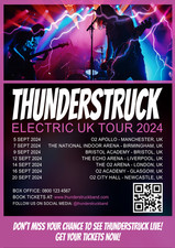

Here are a couple of the latest flyers that I've designed. One is for a Neurodiverse Job Club, which features bold, eye-catching colours that are gentle on the eyes, along with simple, diverse human characters representing neurodiverse individuals. It showcases a strong visual hierarchy and clearly explains what the programme entails. The other is a practice piece for a band tour poster, Thunderstruck. To create it, I used a dramatic band photo sourced from FreePik and incorporated a lighting overlay. I then applied a black background with slight transparency for the main information section, using white text and a pink accent colour drawn from the lighting in the photo as borders and dividers, whilst also emphasising the tour name and link text.
The contrast between the Thunderstruck poster and the “Blood of the Alternative” band poster is noteworthy. By looking at the two posters, I can see how much I have grown and improved as a designer. The Blood of the Alternative poster is decent, but I have made strides in my layout and the positioning of typography and visuals. I've also aimed to simplify while still creating bold and engaging visuals.
The Story of Raising Lincoln's Young Voices


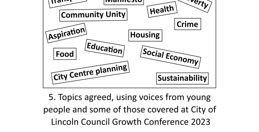


A commission by LocalMotion Lincoln to create a collection of images that illustrate the journey they have taken to amplify and engage with young people's voices in Lincoln. The storyboard details how LocalMotion Lincoln collaborated with The Network Lincoln and local young people to organise the "Turning up the Volume on Young Voices" event. This event provided the first opportunity for young individuals to express their concerns and opinions about their city and what can be done to foster growth within their local community.
Recently, when I created human characters for illustrations, I started with a basic human frame, which I then dressed up with hair, faces, and clothing to impart personality. I adapt sizes, colours, and visual characteristics to craft a diverse range of characters that reflect the demographic I am visualising. For instance, in these storyboard images, the young people are depicted in vibrant colours with a wide array of unique hairstyles. At the same time, the business professionals are attired in business wear with a duller, muted colour scheme. In my opinion, the characters I created for this project aren’t as strong as those I designed for the Job Club flyer and Lincoln City Half Marathon campaign, as I was experimenting with something new while still conveying the story. However, I can also acknowledge how much I have grown and how I have discovered my artistic style and technique for character design, especially in comparison to the comic book I produced in sixth form.A commission by LocalMotion Lincoln to create a collection of images that illustrate the journey they have taken to amplify and engage with young people's voices in Lincoln. The storyboard details how LocalMotion Lincoln collaborated with The Network Lincoln and local young people to organise the "Turning up the Volume on Young Voices" event. This event provided the first opportunity for young individuals to express their concerns and opinions about their city and what can be done to foster growth within their local community.
Recently, when I created human characters for illustrations, I started with a basic human frame, which I then dressed up with hair, faces, and clothing to impart personality. I adapt sizes, colours, and visual characteristics to craft a diverse range of characters that reflect the demographic I am visualising. For instance, in these storyboard images, the young people are depicted in vibrant colours with a wide array of unique hairstyles. At the same time, the business professionals are attired in business wear with a duller, muted colour scheme. In my opinion, the characters I created for this project aren’t as strong as those I designed for the Job Club flyer and Lincoln City Half Marathon campaign, as I was experimenting with something new while still conveying the story. However, I can also acknowledge how much I have grown and how I have discovered my artistic style and technique for character design, especially in comparison to the comic book I produced in sixth form.
Manifesto animations
The video above showcases the seven motion graphic animations created for an upcoming video for Raising Lincoln’s Young Voices’ manifesto. The various clips represent different sections of the manifesto, and I used a vibrant colour scheme, making the visuals stand out while evoking feelings of youth, hope, and diversity. I prefer the human character I designed for these clips, as it is an improved version of the ones I created for the storyboard. It was also a delightful challenge to animate different elements and interpret the manifesto lines through my visuals. Some are simpler than others, while some are pretty detailed.
Over the years, I have found that some skills remain with you, while others require continual relearning and practice. I am pleased to have had opportunities to work on various projects that demanded different types of content and styles, ranging from videos and photography to flyers, illustrations, and motion graphics. This has allowed me to consistently practise and develop my design skills while learning new things along the way. For this project, I used a new software called Cavalry, which made it enjoyable to learn how to animate and create the quality motion graphics I desired.
“What is true success in life? True success means winning in your battle with yourself. Those who persist in the pursuit of there dreams, no matter what hurdles, are winners in life, for they have won over their weaknesses" - Daisaku Ikeda
Conclusion
Looking back at the work I created as a teenager compared to now, it's clear just how far I’ve come—not only in terms of skill but also in confidence, creativity, and understanding my unique style. Growth doesn’t always feel obvious in the moment, but reflection shows how each project, mistake, and experiment has shaped who I am today as a creative. I’m proud of that journey, and I’m excited about where it’s heading next.
If you're creative, I encourage you to look back at your early work. What do you notice? What makes you cringe, laugh, or feel proud? Growth is never linear, but every step matters. Share your journey in the comments, or get in touch if you’d like to collaborate, swap stories, or connect about creativity and design.
Get in touch by filling out a contact form or emailing me at
Explore my work www.lou-gebbie.com


Comments